Quiet-Luxury Color Palette: Oatmeal, Stone & Ink

Why This Trio Is the Beyoncé of Color Combos

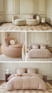
Ever scroll through Pinterest, stop at a living room pic, and just stare because it looks like a million bucks… but you can’t quite tell why? That’s the quiet-luxury palette working its sneaky magic.

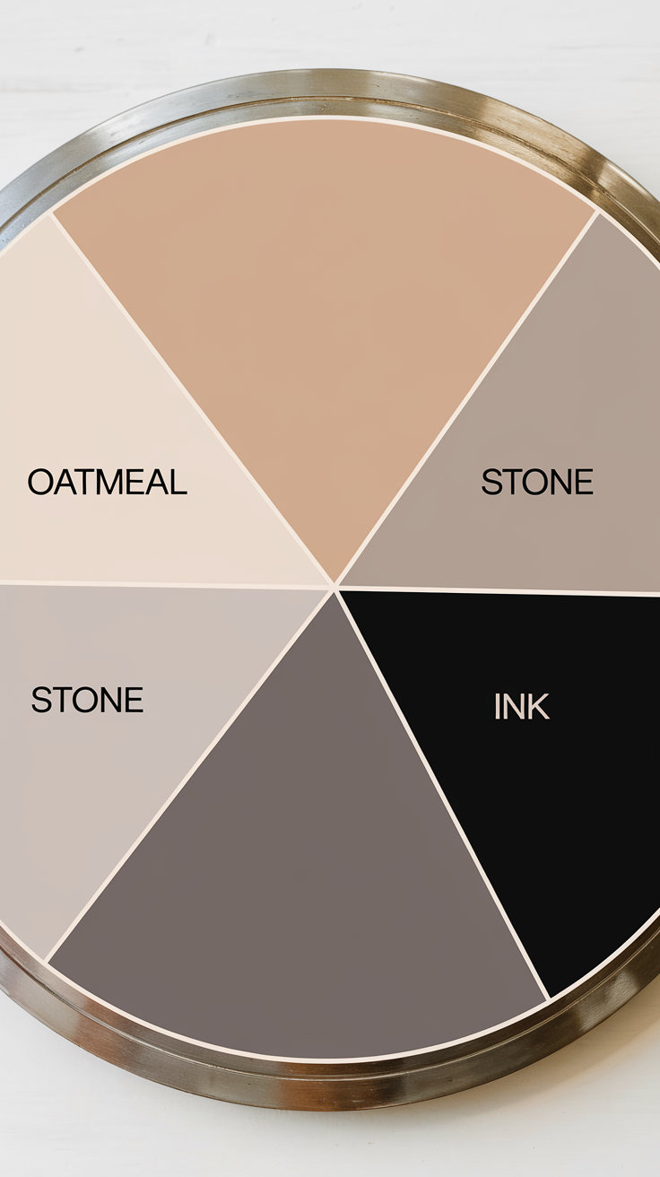
And guess what? It’s all about Oatmeal, Stone, and Ink—a color combo that whispers sophistication without screaming, “Look at me, I’m expensive.” (Although, yes, it totally looks expensive.)

In this guide, I’m breaking down why this palette works, how to style your space around it, and how to use my custom Lightroom preset pack to edit your photos like a minimalist interior influencer. Ready? Let’s color.

What Even Is a Quiet-Luxury Color Palette?

Think: Understated. Rich. Effortless.
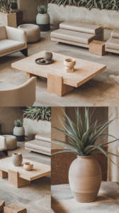
quiet-luxury palette is all about muted tonessubtle depth, and a vibe that says “I care about quality” without needing to prove it. Forget loud accent walls and neon throw pillows. We’re going full cashmere sweater energy here.

Top traits:

  • Neutral, warm undertones

  • Organic and timeless finishes

  • Layers of texture over pop colors

  • Inspired by nature (but like… a very chic version of nature)

Why These Three Colors?

  • Oatmeal = soft, warm, and calming. Think creamy linen or that perfect foam on your latte.

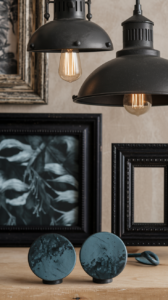
  • Stone = grounded and organic. It adds dimension without drama.

  • Ink = the dark horse. Adds contrast, depth, and that subtle hint of edge every neutral room needs.

Styling Your Living Room Around This Palette

Start with a Neutral Base (Oatmeal Zone)

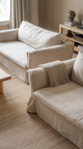
Your couch, your curtains, your biggest textile pieces—this is where oatmeal shines. It reflects light beautifully, feels welcoming, and pairs with literally anything.

Look for:

  • Belgian linen sofas

  • Bouclé or wool throws

  • Neutral jute or wool rugs

Pro tip: Choose textures that feel as good as they look. Luxury is a vib

Add Structure with Stone Accents

Stone grounds the room. Use it for items that create architectural shape or solid presence.

Ideas:

  • Concrete planters

  • Travertine coffee tables

  • Ceramic vases in sandy grays

IMO, stone adds that “I live in a magazine spread” vibe. No one needs to know you got the look from Etsy or Target. 😉

Bring the Drama with Ink (Minimal but Mighty)

Ink = your contrast queen. You don’t need a lot, but without it, your room might look like a bowl of beige oatmeal. (And not the photogenic kind.)

Add it in:

  • Metal accents (black matte legs on chairs)

  • Picture frames

  • A throw pillow or two

  • Abstract artwork

Rhetorical question: Ever noticed how a tiny bit of black makes the whole room look sharper? Exactly.

Editing Photos With the Same Palette Energy

ou don’t just style your room—you capture it, right? Whether you’re posting on IG or listing something on Etsy, your photos deserve that soft, cohesive glow.

That’s where my Oatmeal.Stone.Ink Lightroom Preset Pack comes in. 🖤

Why You’ll Love This Preset Pack

  • Designed for interiors and lifestyle flatlays

  • Preserves neutral tones without yellowing whites

  • Adds soft contrast for that dreamy, curated vibe

  • Perfect for Pinterest pins and Reels covers

What You Get:

  • 6 Lightroom presets (mobile + desktop)

  • PDF setup guide

  • Bonus: A video tutorial on editing for natural light

Link to buy or download here ➝ [Insert link]

Pro Styling Tips: Keep It Luxe, Not Boring

Let’s be real—beige rooms can go bland real fast. Here’s how to avoid that:

  • Mix textures: Think boucle + suede + rattan + ceramic.

  • Use odd numbers: Style shelves or coffee tables in 3s or 5s.

  • Layer with intention: Stack books, trays, and candles for that “undone but perfect” look.

  • Throw in vintage: Adds soul to the softness. A patinaed brass lamp works like magic.

FYI: Luxury lives in the details. Pay attention to what you leave out, not just what you put in.

Color Palette Breakdown + Examples

Let’s visualize it:

OATMEAL:

  • Creamy whites

  • Pale sand

  • Soft taupe

Use for:

  • Walls

  • Upholstery

  • Bedding

STONE:

  • Putty gray

  • Mushroom

  • Warm greige

Use for:

  • Side tables

  • Floor tiles

  • Rugs

INK:

  • Deep charcoal

  • Muted black

  • Ink blue (with a touch of stormy gray)

Use for:

  • Lighting fixtures

  • Art frames

  • Hardware (drawer pulls, knobs)

Want a cheat sheet? I got you—scroll down to the freebie 😉

Final Thoughts

Quiet luxury isn’t just a trend—it’s a mood. It’s for the girls (and guys) who crave calm, appreciate detail, and don’t need to shout to feel seen.

The Oatmeal, Stone & Ink palette gives your space that rich, editorial look while still feeling like home. And with the right styling tools—and maybe a little preset help—you can absolutely pull it off.

So go forth, color match with confidence, and please send me pics when your space starts looking like a Kinfolk cover.

Stay neutral. Stay iconic. ✌🏼

Pinterest

Leave a Reply

Your email address will not be published. Required fields are marked *

ARABIC