Ever walked into a room and felt an immediate aaahh moment? Like your nervous system just exhaled? That, my friend, is what monochrome magic does when done right. And when you pair it with the quiet luxury aesthetic? Game over. Sophistication, serenity, and that subtle I-have-my-life-together energy? Check, check, and check.
Now, I know what you might be thinking: “Won’t using just one color feel… boring?” Honestly? Not if you know the rules—and the delicious little secrets that make it work.
What Is Quiet Luxury, Really?
Before we start painting everything greige (kidding, kind of), let’s get clear on what quiet luxury even means.
Quiet luxury = understated elegance with rich textures, timeless design, and a lack of logos shouting at you. It’s about feeling expensive without having to prove it.
Monochrome design fits in perfectly here because:
It looks intentional and curated.
It feels peaceful (read: zero chaos).
It lets materials, shapes, and light take the spotlight.
Think of it like your wardrobe: a camel cashmere sweater, matching trousers, and a silk scarf. One color. Different vibes. Maximum impact.
Why Monochrome Works (and Isn’t Boring)
Let’s bust a myth: monochrome isn’t just white walls and zero personality. Done well, it can be the most expressive form of interior styling.
Here’s why:
It creates instant harmony. No more clashing colors or visual clutter.
It highlights texture. Velvet, wood grain, linen—they all get to shine.
It’s super photogenic. (Hellooo, Pinterest.)
Ever notice how elegant homes don’t feel try-hard? Monochrome helps with that. It whispers luxury instead of screaming it.
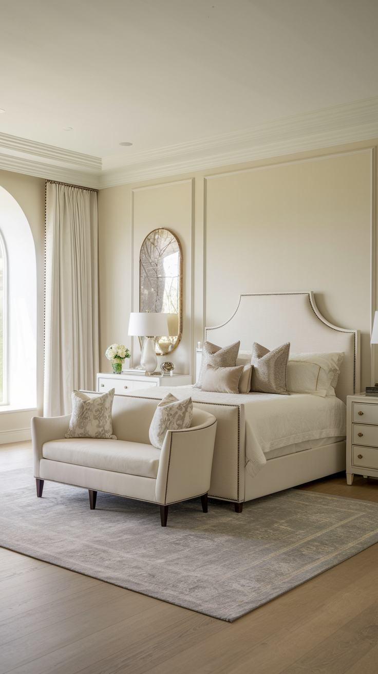
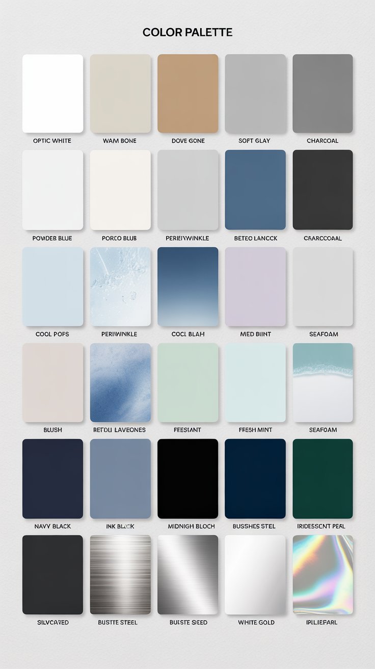
Greige (gray + beige) — literally the Instagram of colors.
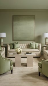
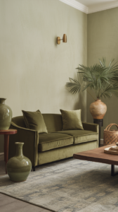
Sage Green — soft, natural, and calming.
Dusty Rose or Blush — feminine, muted, still grown-up.
Charcoal — moody, rich, modern.
Chocolate Brown — earthy elegance that doesn’t feel dated.
Avoid: Anything neon. Unless you’re aiming for a futuristic yogurt shop vibe.
Tip: Check your wardrobe. What color do you always gravitate toward? Start there.
Step 2: Layer the Heck Out of Textures
Let’s be real: if you use one color but everything is the same finish, the room will feel flat AF. Texture is your BFF here.
Ways to layer like a pro:
Mix hard and soft (think: linen drapes with a marble coffee table)
Play with finishes (matte vs glossy, smooth vs nubby)
Use natural materials (wood, stone, ceramic, wool)
Incorporate depth with tufting, slubbed fabrics, grainy wood, or ribbed surfaces
Ever tried velvet on velvet? I have. It felt like living in a chic jewelry box. 10/10, would recommend (but mix in leather or rattan to avoid full drama).
Here’s a quiet luxury trick that almost no one talks about: contrast within a single hue.
Yep, just because you picked, say, olive green doesn’t mean you’re limited to one exact shade.
Layer light, mid, and deep tones of the same color. This builds visual interest and makes the space feel rich.
Example:
Pale sage walls
Deep olive velvet sofa
Mossy green ceramic vases
Result: Instant depth. No boredom in sight.
Step 4: Add Personality with Accents (Still On Theme)
Now let’s break up the matchy-matchy danger zone.
Accent pieces can still follow the theme but bring in variety via:
Shape: curvy, geometric, sculptural
Material: rattan, glass, leather, ceramic
Scale: oversized pillows, petite trays, tall vases
IMO: A monochrome space without personality is just… beige. Literally.
My trick? Always add one weird object (mine is a handmade asymmetrical bowl that looks like it melted slightly—chic chaos).
Step 5: Light It Like You Mean It
You can’t do monochrome without layering your lighting. Otherwise, your room just sits there like a sad Instagram post with no filter.
Must-haves:
Ambient lighting (aka your ceiling fixture)
Task lighting (like a reading lamp)
Accent lighting (sconces, LED strips, candles)
Lighting adds dimension to your tones. Ever seen taupe in golden hour light? Chef’s kiss.
Oh, and for the love of vibes, install a dimmer.
Step 6: Don't Forget the Floor and Ceiling
This is where most people chicken out. But elegant rooms consider every surface.
For floors:
Go tone-on-tone with area rugs (cream on cream, blush on blush, etc.)
Natural fibers like jute or wool = chef’s kiss for quiet luxury
For ceilings:
Add molding in the same color as the walls for a built-in feel
Paint the ceiling in a slightly lighter or deeper tone of your main hue
Yes, painting your ceiling sounds scary. But it’s the design version of contouring your face. Trust me.
Step 7: Edit Ruthlessly (Then Edit Again)
You know that friend who accessorizes too much and ends up looking like a Christmas tree? Don’t let your space be that friend.
Elegant monochrome = restraint.
Ask yourself:
Does this piece actually add something?
Am I keeping it just because I spent money on it?
Would this look better if I removed two things?
If the answer is yes to the last one, congrats. You’re officially designing like an interior minimalist with expensive taste 🙂
Common Mistakes to Avoid (So Your Room Doesn’t Look Like a Rental)
Using flat wall paint and flat furniture with no texture
Choosing the same exact color for every item (hello, snoozefest)
Forgetting lighting—seriously, stop doing this!
Not anchoring the room with statement art or one focal piece
Using cheap materials that look plasticky instead of plush or organic
If it feels lifeless or soulless, something’s off. Go back and layer, contrast, or edit.
Conclusion: Quiet Luxury Doesn’t Mean Boring
So here’s the tea: decorating with one color doesn’t limit your creativity—it amplifies it.
The beauty of monochrome magic is that it forces you to be intentional. You can’t hide behind bold colors or funky prints. You have to make thoughtful choices that speak softly but confidently.
And that, my friend, is the whole point of quiet luxury.
So go ahead. Pick a shade. Obsess over the textures. Get lost in the tones. And when someone walks into your space and says, “Why does this feel so… calm?” you can just smile and say, “Monochrome magic, baby.”
PS: Want a free monochrome mood board template to help you plan your space? Let me know—I’ll email you the pretty one I use 😉