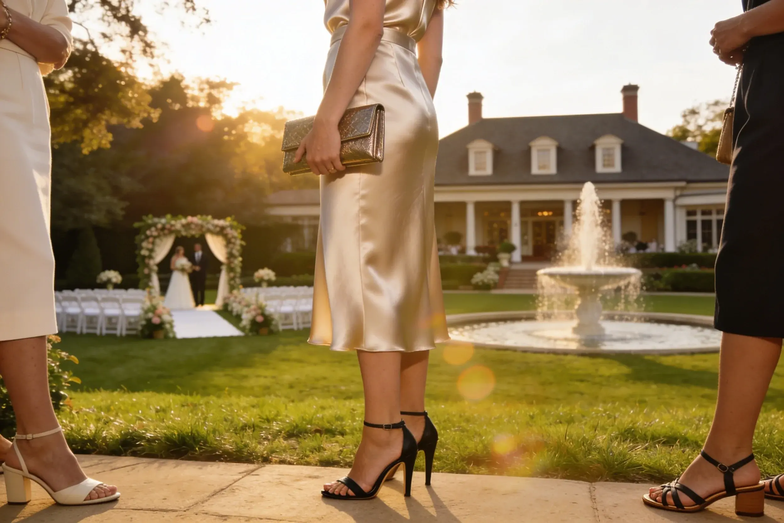


Some colors whisper wealth while others scream “new money.” If you want that quiet, inherited-pearls kind of vibe, your palette matters more than any logo. You don’t need a trust fund; you just need the right hues. Let’s decode the colors that say, “I know good taste, and I don’t need to prove it.”
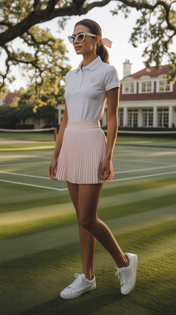
Old money style favors restraint over spectacle.
Think timeless over trendy, patina over polish. Colors with depth and softness telegraph history, quality, and a life well-lived. Loud brights?
Fun for a beach club. The classics? They look good at a country house or a boardroom.
FYI: subtle saturation equals instant credibility.
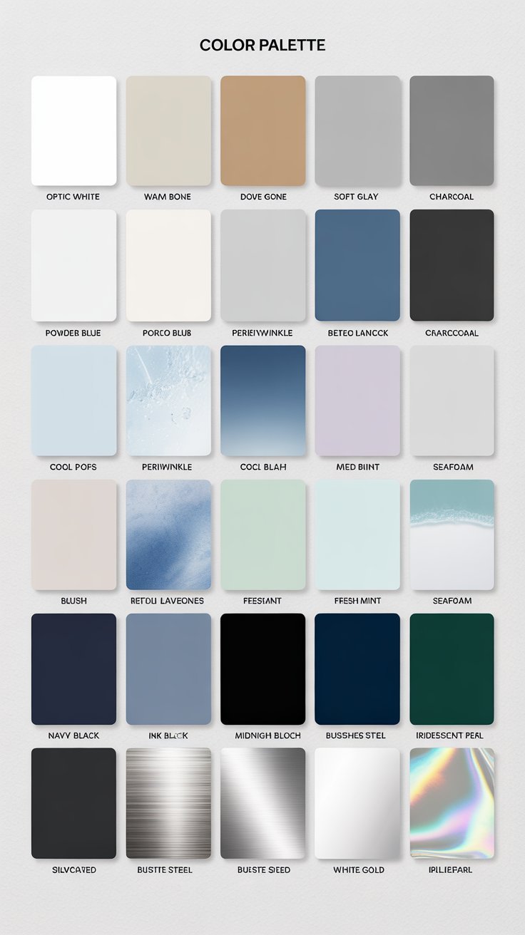
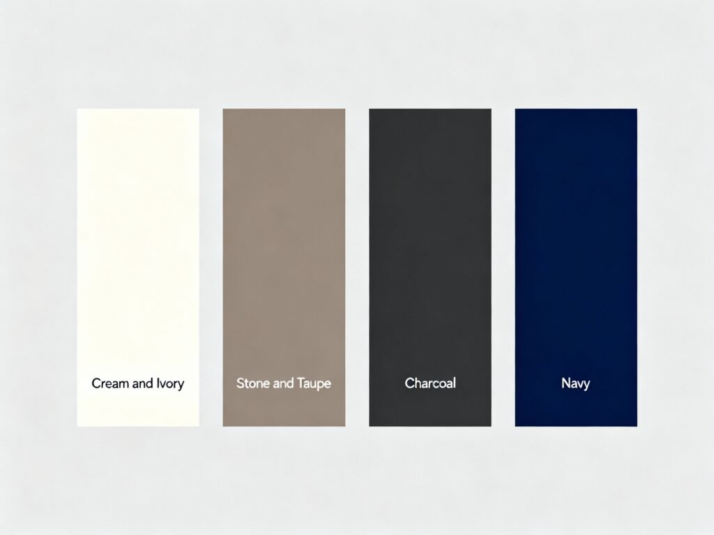
Start with neutrals that look expensive even when they aren’t. These create the canvas for everything else and instantly calm down a space or outfit.
Mix textures, not shades. Pair matte walls with velvet upholstery, or a crisp navy blazer with a nubby knit.
Keep the palette tight and let materials do the flexing. Old money doesn’t need neon, IMO.
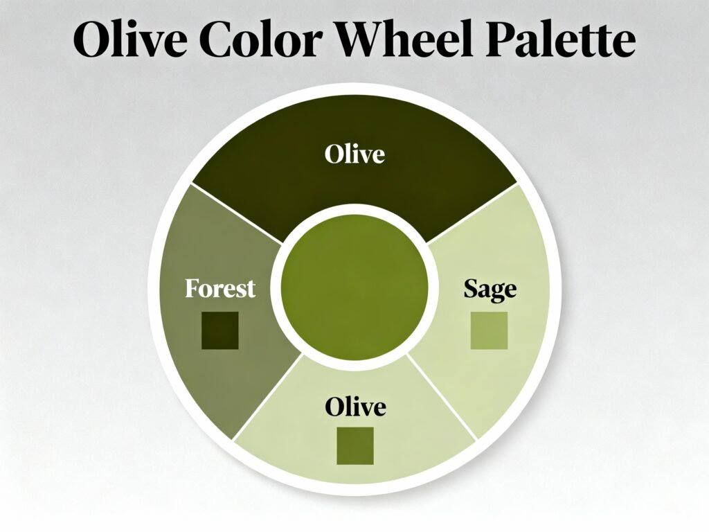
Greens with depth channel libraries, hunting prints, and 19th-century botanical plates. They feel grounded and grown-up.
Try forest green with cream and dark wood for instant manor-house mood. Add antique gold accents sparingly.
Olive loves tan and chocolate brown. Sage shines with linen and unlacquered brass—yes, the kind that actually ages.
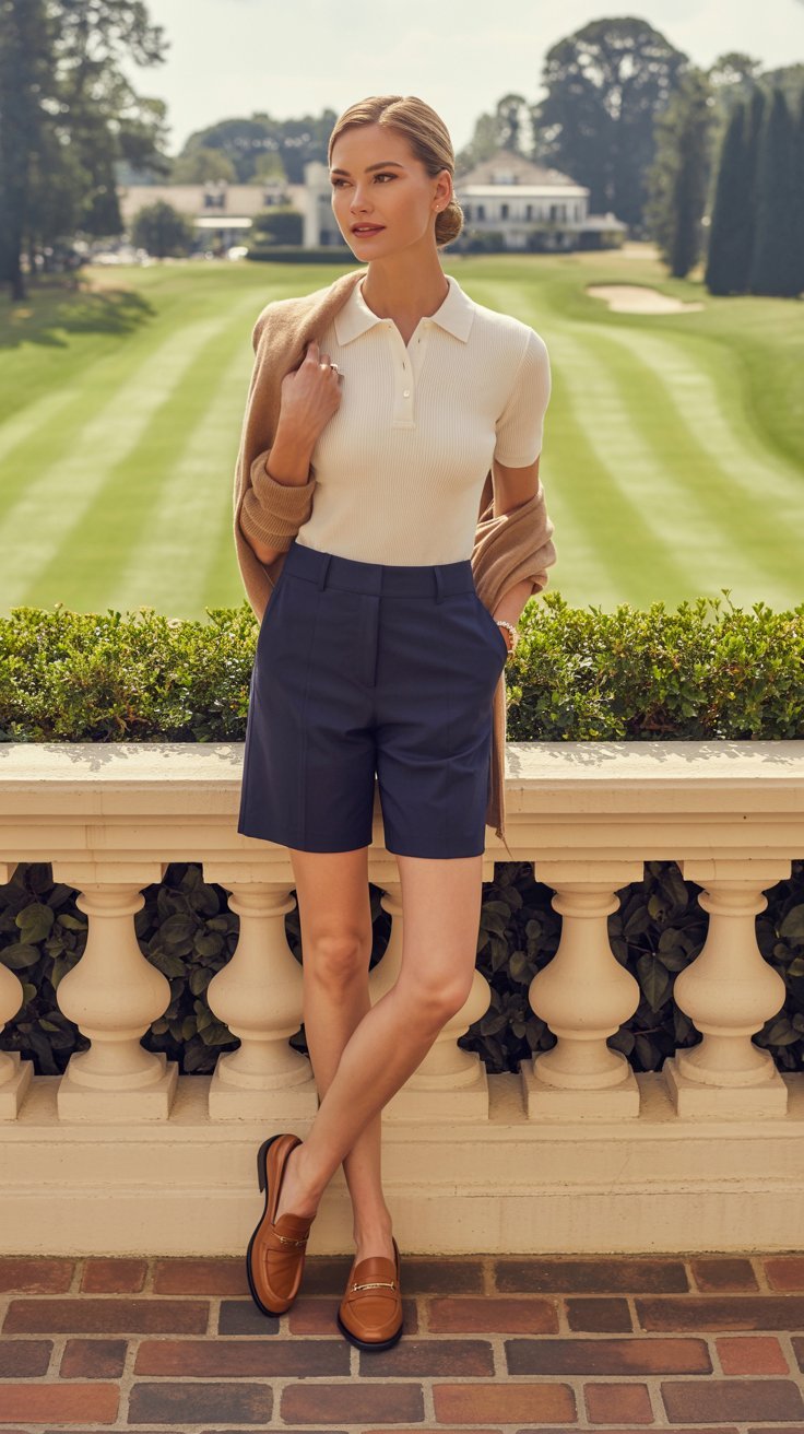
Navy communicates competence without shouting. Ink blue pushes it moodier and even more refined.
Black can skew edgy or modern. Navy does classic without trying.
If you want stealth wealth, choose blue for coats, upholstery, and eveningwear trims. It reads softer and more expensive.
These reds feel like vintage Bordeaux and old leather bags. They whisper heritage, not holiday party.
Stick to muted, wine-like reds.
Pair with navy, charcoal, or camel to avoid looking like a school uniform. A single oxblood accessory can elevate an entire look. Overdo it and you’re suddenly a themed restaurant.
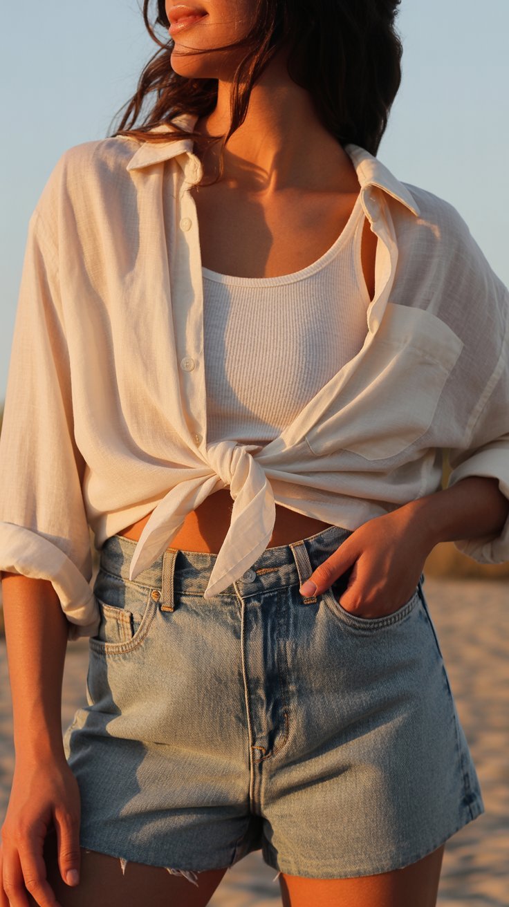
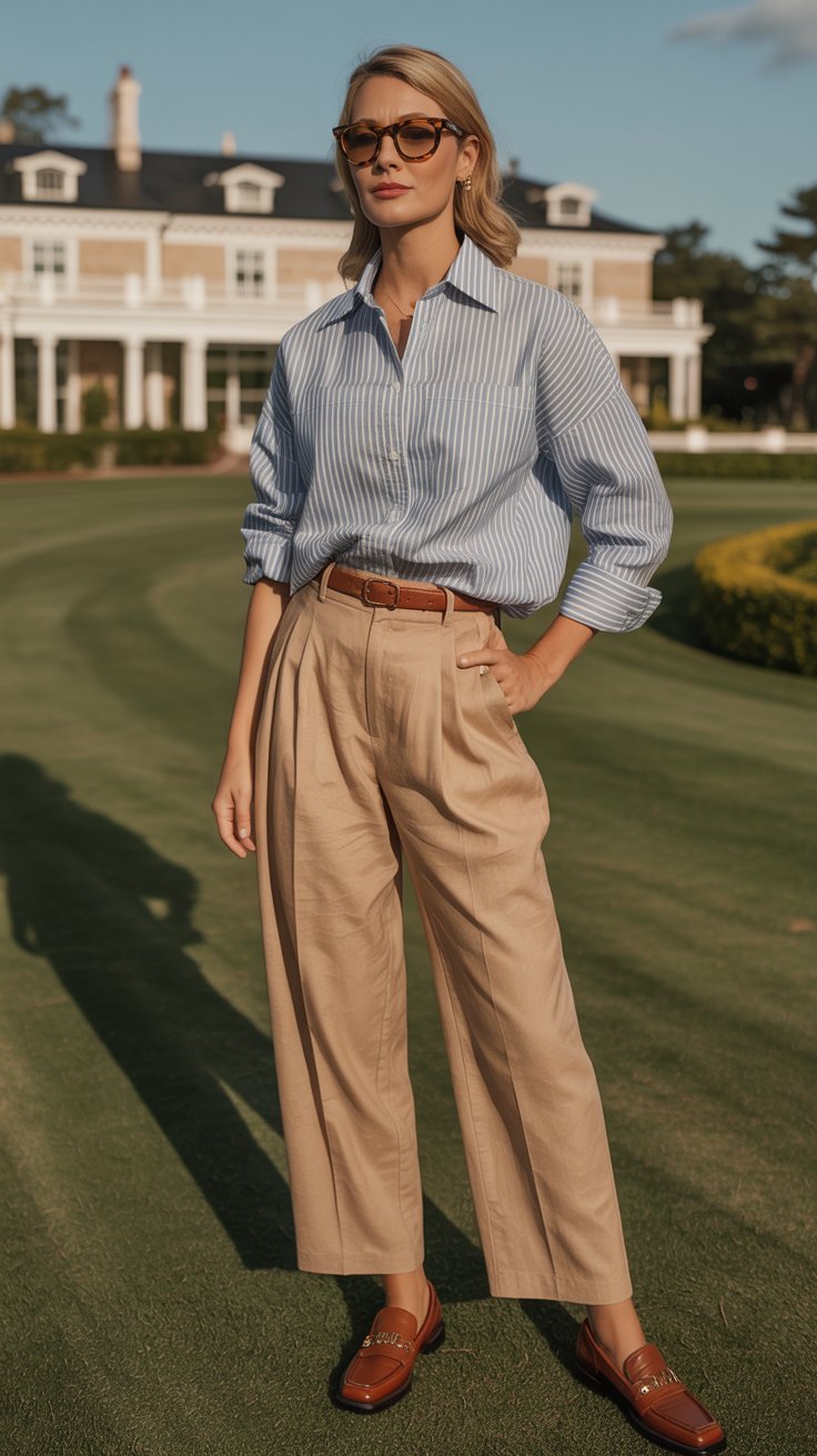
These browns are the heart of old money warmth.
They suggest equestrian weekends and libraries that smell like paper and cedar.
A camel coat in cheap fabric falls flat. In wool-cashmere?
Chef’s kiss. Brown tones crave texture: think tweed, suede, flannel, and linen. That tactile depth reads “old money” from five feet away.
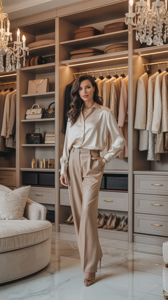
Bright white can feel showroom-new.
Old money prefers whites with a little warmth and history baked in.
Layer shades: bone sheets, ivory duvet, cream throw. Add wood and metal to avoid sterility. And yes, let patina happen.
Perfection looks try-hard. IMO, a scuff tells a better story than a shine.
You don’t need brights, but you do need personality. Choose accents that nod to heritage.
Choose three accent shades max and repeat them across a space or wardrobe. That repetition creates cohesion.
Scatter wildly and you lose the “collected over time” vibe that old money nails.
Let’s get practical. Here’s how the palette comes alive in real life.
For women who value clarity, ease, and understated elegance.
I offer a discreet personal styling service focused on building a wardrobe that works across every area of your life.
Private styling — by application only.
→ Apply here
Yes, sparingly. Black can look sharp with camel or cream, but navy usually feels richer and less severe.
If you love black, keep it to shoes, frames, or a single statement piece.
Lean into bone, taupe, and charcoal with high-quality textures. Add one heritage color—olive or navy—to break monotony. Minimalism can look old money when you prioritize materials over quantity.
Patterns are welcome—just keep them classic.
Think houndstooth, pinstripes, ticking, toile, and Persian rugs. If you’re nervous, start small with a cushion or tie.
Test big swatches in different light. Old money hues often carry gray or brown undertones.
Look at the color morning and night before committing. FYI: matte finishes usually read more sophisticated.
Absolutely—just choose a warm white with a whisper of cream or gray. Pair it with natural woods, brass, and textured fabrics so it doesn’t feel clinical.
Unlacquered brass, bronze, and aged silver.
They patinate over time and play nicely with olive, navy, and camel. High-gloss chrome can skew modern, which isn’t the goal here.
Old money elegance lives in restraint, depth, and a little patina. Build your palette with grounded neutrals, heritage greens, navy, and warm browns, then add soft accents that look collected over time.
Keep textures rich, finishes matte, and brights on mute. Do that, and your style will look quietly expensive—no trust fund required.